
import matplotlib
if not hasattr(matplotlib.RcParams, "_get"):
    matplotlib.RcParams._get = dict.get
Synthetic Control (SC)#
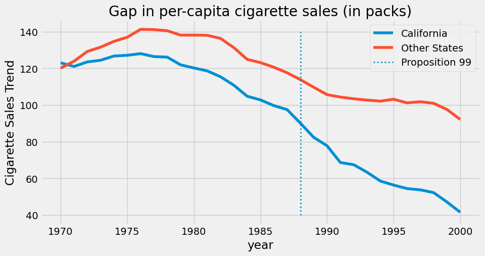
담배값이 오른다고 사람들이 담배 피는 양을 줄일까요, 아니면 중독된 사람들은 가격과 무관하게 피는 양이 유지될까요?
Proposition 99 라는 법이 캘리포니아에서 통과되었습니다. 이 법은 흡연에 대한 세금을 크게 늘리는 법이었습니다.
DiD에서처럼 캘리포니아와 사전평행 추세가 있는 주와 비교해도 되겠지만, Synthetic Control은 1:1 비교보다 1:N 비교를 통해 인과 효과를 확인하는 방법을 제안합니다.
import warnings
warnings.filterwarnings('ignore')

import pandas as pd
import numpy as np
from matplotlib import style
from matplotlib import pyplot as plt
import seaborn as sns
import statsmodels.formula.api as smf

%matplotlib inline

pd.set_option("display.max_columns", 10)
style.use("fivethirtyeight")
cigar = pd.read_csv("../data/matheus_data/smoking.csv")
cigar.query("california == True").head() # 캘리포니아는 state == 3에 위치
| state | year | cigsale | lnincome | beer | age15to24 | retprice | california | after_treatment | |
|---|---|---|---|---|---|---|---|---|---|
| 62 | 3 | 1970 | 123.000000 | NaN | NaN | 0.178158 | 38.799999 | True | False |
| 63 | 3 | 1971 | 121.000000 | NaN | NaN | 0.179296 | 39.700001 | True | False |
| 64 | 3 | 1972 | 123.500000 | 9.930814 | NaN | 0.180434 | 39.900002 | True | False |
| 65 | 3 | 1973 | 124.400002 | 9.955092 | NaN | 0.181572 | 39.900002 | True | False |
| 66 | 3 | 1974 | 126.699997 | 9.947999 | NaN | 0.182710 | 41.900002 | True | False |
ax = plt.subplot(1, 1, 1)

(cigar
 .assign(california = np.where(cigar["california"], "California", "Other States"))
 .groupby(["year", "california"])
 ["cigsale"]
 .mean()
 .reset_index()
 .pivot(index="year", columns="california", values="cigsale")
 .plot(ax=ax, figsize=(10,5)))

plt.vlines(x=1988, ymin=40, ymax=140, linestyle=":", lw=2, label="Proposition 99")
plt.ylabel("Cigarette Sales Trend")
plt.title("Gap in per-capita cigarette sales (in packs)")
plt.legend();
우리의 목표#
아쉽게도 캘리포니아는 이미 정책 개입을 경험한 처리 집단이기에 정책의 효과를 온전하게 반영하지 못 하고 있습니다. (즉, 캘리포니아의 사후 관측치는 단순히 자연적인 추세만을 반영하는 것이 아니라, 정책 효과가 혼합되어 나타난 결과로 이해됩니다.)
이를 해결하기 위해 우선 캘리포니아와 유사한 개입 이전 추세를 재현할 수 있는 가상의 대조 집단(합성 통제군)을 구성합니다.
이를 통해 개입 이후 시점에서 실제 캘리포니아와 합성 통제군 간의 차이를 정책 효과로 식별하면 그것이 정책의 효과를 표현하게 됩니다.
1. 기본 원리에 맞게 최적화 (QP)로 구현하기#
STEP 1: 개입 이전 추세의 담배 판매량 추출
STEP 2: X (처치 이전 나머지 주)를 활용하여 y (처치 이전 캘리포니아) 추정
Optimal Weight를 찾아서 y와 비슷하게 구성 (즉, \(X W \approx y\))
제약조건: weight는 음수가 불가하며, 합은 1이 되도록 지정.
STEP 3: 가중치 기반으로 Estimate 생성
# STEP 0: Synthetic Control에 맞는 Loss function 및 Optimization 정의

from scipy.optimize import fmin_slsqp
from toolz import partial

def loss_w(W, X, y):
    return np.sqrt(np.mean((y - X.dot(W))**2))

def get_w(X, y):
    w_start = [1/X.shape[1]]*X.shape[1] # inital value

    weights = fmin_slsqp(partial(loss_w, X=X, y=y),
                         np.array(w_start),
                         f_eqcons=lambda x: np.sum(x) - 1, # weights to sum up to 1
                         bounds=[(0.0, 1.0)]*len(w_start), # 0~1
                         disp=False)
    return weights
# STEP 1: 개입 이전 추세의 담배 판매량 추출

inverted = (cigar.query("~after_treatment")
            .pivot(index='state', columns="year")["cigsale"]
            .T)

inverted.head()
| state | 1 | 2 | 3 | 4 | 5 | ... | 35 | 36 | 37 | 38 | 39 |
|---|---|---|---|---|---|---|---|---|---|---|---|
| year | |||||||||||
| 1970 | 89.800003 | 100.300003 | 123.000000 | 124.800003 | 120.000000 | ... | 122.599998 | 124.300003 | 114.500000 | 106.400002 | 132.199997 |
| 1971 | 95.400002 | 104.099998 | 121.000000 | 125.500000 | 117.599998 | ... | 124.400002 | 128.399994 | 111.500000 | 105.400002 | 131.699997 |
| 1972 | 101.099998 | 103.900002 | 123.500000 | 134.300003 | 110.800003 | ... | 138.000000 | 137.000000 | 117.500000 | 108.800003 | 140.000000 |
| 1973 | 102.900002 | 108.000000 | 124.400002 | 137.899994 | 109.300003 | ... | 146.800003 | 143.100006 | 116.599998 | 109.500000 | 141.199997 |
| 1974 | 108.199997 | 109.699997 | 126.699997 | 132.800003 | 112.400002 | ... | 151.800003 | 149.600006 | 119.900002 | 111.800003 | 145.800003 |
5 rows × 39 columns
y = inverted[3].values # 우리가 관심 있는 주
X = inverted.drop(columns=3).values  # 통제집단을 위한 나머지 주

print(y.shape, X.shape)
(19,) (19, 38)
# STEP 2: X (처치 이전 나머지 주) -> y (처치 이전 캘리포니아) 추정

calif_weights = get_w(X, y)
print("Sum:", calif_weights.sum())
np.round(calif_weights, 4)
Sum: 1.0000000000016402
array([0.    , 0.    , 0.0148, 0.1091, 0.    , 0.    , 0.    , 0.    ,
       0.    , 0.    , 0.    , 0.    , 0.    , 0.    , 0.    , 0.    ,
       0.    , 0.2318, 0.    , 0.2049, 0.0454, 0.    , 0.    , 0.    ,
       0.    , 0.    , 0.    , 0.    , 0.    , 0.    , 0.    , 0.    ,
       0.3939, 0.    , 0.    , 0.    , 0.    , 0.    ])
# STEP 3: 가중치 기반으로 Estimate 생성

calif_synth = cigar.query("~california").pivot(index='year', columns="state")["cigsale"].values.dot(calif_weights)
plt.figure(figsize=(10,6))
plt.plot(cigar.query("california")["year"], cigar.query("california")["cigsale"], label="California")
plt.plot(cigar.query("california")["year"], calif_synth, label="Synthetic Control")
plt.vlines(x=1988, ymin=40, ymax=140, linestyle=":", lw=2, label="Proposition 99")
plt.ylabel("Per-capita cigarette sales (in packs)")
plt.legend();
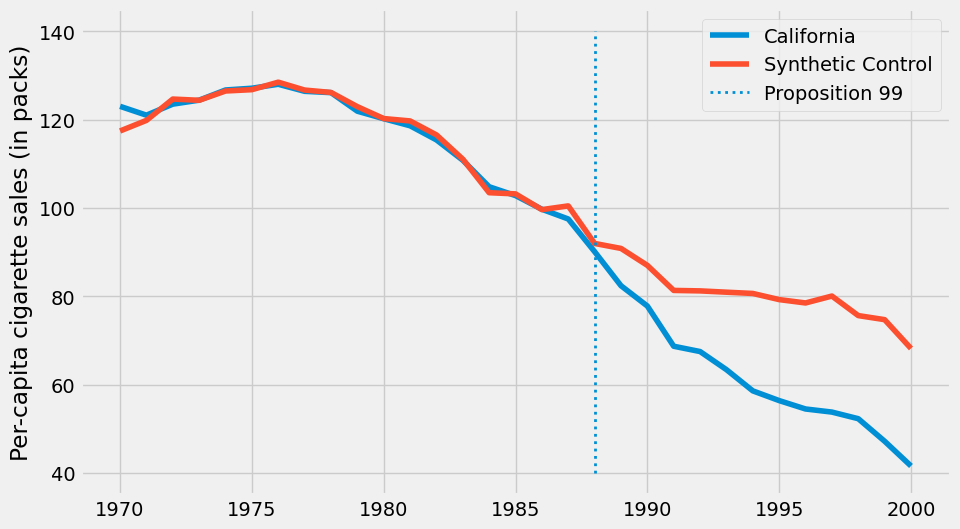
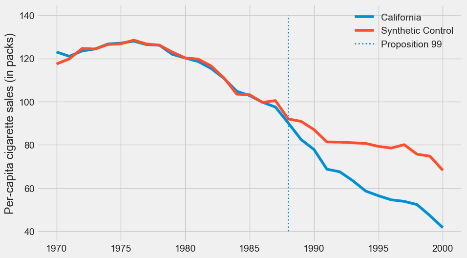
눈으로는 충분히 비슷해보이는데, 이 분석이 타당하는 것을 어떻게 보여야할까요?
2. 주요 변수 확인하기#
Synthetic Control을 사용할 때는 일반적으로 통제집단 (donor pool)의 구성과 주요 공변량의 균형이 잘 맞춰졌는지를 보고해야합니다.
여기서는 공변량 (retprice) 와 결과 (cigsale) 를 기준으로 결과를 출력하였습니다.
# 공변량도 포함하여 다시 분석 수행

features = ["cigsale", "retprice"]

with_covariate = (cigar.query("~after_treatment")
            .pivot(index='state', columns="year")[features]
            .T)

y = with_covariate[3].values
X = with_covariate.drop(columns=3).values

calif_weights = get_w(X, y)

donor_states = sorted(cigar.query("~california")['state'].unique())
weights_df = pd.DataFrame({
    'State': donor_states,
    'Synthetic Control Weight': calif_weights
})
weights_df.set_index('State', inplace=True)

print("### Donor pool 구성")
weights_df[weights_df['Synthetic Control Weight'] > 0.001]
Donor pool 구성
| Synthetic Control Weight | |
|---|---|
| State | |
| 5 | 0.085232 |
| 21 | 0.113007 |
| 22 | 0.105056 |
| 23 | 0.456622 |
| 34 | 0.240084 |
calif_data_pivot = cigar.query("california and ~after_treatment").pivot(index='year', columns='state')[features]
donor_data_pivot = cigar.query("~california and ~after_treatment").pivot(index='year', columns='state')[features]

calif_means = y.reshape(len(features), -1).mean(axis=1)
synthetic_means = X.dot(calif_weights).reshape(len(features), -1).mean(axis=1)
donor_pool_means = donor_data_pivot.stack().mean()

table_df = pd.DataFrame({
    'California': calif_means,
    'Synthetic California': synthetic_means,
    'Donor Pool Average': donor_pool_means
}, index=features)

print("### Weighted Covariate and Y Table")
table_df
### Weighted Covariate and Y Table
| California | Synthetic California | Donor Pool Average | |
|---|---|---|---|
| cigsale | 116.210526 | 116.402587 | 130.569529 |
| retprice | 66.636843 | 66.311319 | 64.504571 |
3. 모델을 신뢰할 수 있는가? (Robustness & Sensitivity)#
모델을 단순히 활용하는 것을 넘어서, 현재 적용한 모델을 신뢰할 수 있는지 어떻게 볼 수 있을까요? 이를 위해 저희는 모델의 신뢰성을 확인하기 위해 2가지 질문에 답할 필요가 있습니다.
Placebo Test) 만약 우리가 추정한 효과가 정말 그 정책때문에 발생한 것이라면, 정책이 없었던 다른 시간이나 다른 지역에 똑같은 분석을 적용했을 때는 그런 큰 효과가 나타나지 않아야 합니다.
Leave-one-out) 분석이 특정 집단의 결과값 (e.g., 특정 주) 에만 의존하지 않아야 합니다.
Synthetic control에서는 이에 대답하기 위해 주로 Placebo Test 및 Leave-one-out 방법을 사용합니다.
3-1. Placebo Test (AA Test)#
우선 첫번째 질문인 “만약 우리가 추정한 효과가 정말 그 정책때문에 발생한 것이라면, 정책이 없었던 다른 시간이나 다른 지역에 똑같은 분석을 적용했을 때는 그런 큰 효과가 나타나지 않아야 합니다.” 에 대해 답해보겠습니다.
이를 위해 우리는 “만약 정책이 없었다면 어땠을까?” 라는 질문을 던지는 위약 연구 (Placebo Test)를 수행합니다.
[In-Time Placebos] 정책 시행 시점을 과거의 다른 시간으로 인위적으로 옮겨서 분석하여 효과적인 분석인지를 확인합니다. 만약 우리 모델이 제대로 작동한다면, 오직 실제 정책이 시행된 1988년에만 유의미한 효과를 감지해야 하며, 가짜 정책 시점에는 효과가 나타나서는 안 됩니다.
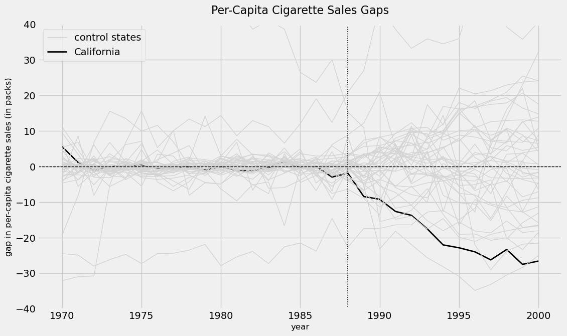
[In-Space Placebos] 정책의 영향을 받지 않은 통제 집단(donor pool)의 각 단위들을 마치 처리 집단인 것처럼 하나씩 돌아가면서 가짜 효과들의 분포를 만들어줍니다. 이때 실제 효과가 이 분포 내의 평범한 값이라면 그저 우연에 의한 것이며, 극단값이라면 우연히 발생했다고 보기에는 매우 어렵다는 것을 의미합니다.
[Metric]
실제값 (\(Y_1t\)): 처리 집단의 t 시점 실제 결과값
예측값 (\(\sum_{j=2}^{J+1} {w_j}^*{Y_{jt}}\)): donor pool의 가중 평균으로 계산된 합성통제군의 Y 예측값
# Metric 정의

def get_pre_post_mspe(gap_series, treatment_year):
    pre_gap = gap_series[gap_series.index < treatment_year]
    post_gap = gap_series[gap_series.index >= treatment_year]

    pre_mspe = np.mean(pre_gap**2)
    post_mspe = np.mean(post_gap**2)
    return pre_mspe, post_mspe
# Gap (실제값 - 예측값) 계산 함수

def calculate_synthetic_gap(
    data,
    target_unit,
    unit_var,
    time_var,
    outcome_var,
    treatment_year=None
):
    pre_treatment_query = f"{time_var} < {treatment_year}"
    pre_treatment_data = data.query(pre_treatment_query).pivot(
        index=time_var, columns=unit_var, values=outcome_var
    )
    y = pre_treatment_data[target_unit].values
    X = pre_treatment_data.drop(columns=target_unit).values

    weights = get_w(X, y)
    control_units = pre_treatment_data.drop(columns=target_unit).columns
    full_control_data = data[data[unit_var].isin(control_units)].pivot(
        index=time_var, columns=unit_var, values=outcome_var
    )
    synthetic_unit = full_control_data.values.dot(weights)

    actual_unit_df = data[data[unit_var] == target_unit]
    actual_unit = pd.Series(
        actual_unit_df[outcome_var].values,
        index=actual_unit_df[time_var].values
    )

    gap = actual_unit - synthetic_unit
    return gap
3-1-1. In-time Placebos#
정책 시행 시점을 과거의 다른 시간으로 인위적으로 옮겨서 분석하는 방법입니다.
정책이 시행되지 않았던 과거의 임의의 시점 (\(T_{placebo}<T\)) 를 마치 정책이 시행된 것처럼 가정한 후, \(T_{placebo}\) 시점 이전의 데이터만을 사용하여 합성 통제 집단을 구축하고, \(T_{placebo}\) 이후의 가짜 정책 효과를 추정합니다.
base_params = {
    'data': cigar,
    'unit_var': 'state',
    'time_var': 'year',
    'outcome_var': 'cigsale',
    'treatment_year': 1979 # 가상의 기간 설정
}

placebo_gaps = calculate_synthetic_gap(target_unit=3, **base_params)

placebo_gap = pd.DataFrame(placebo_gaps)
print("\nIn-time Placebo 결과 (DataFrame):")
print(placebo_gap.head())
In-time Placebo 결과 (DataFrame):
             0
1970  0.532420
1971 -0.411551
1972  0.223776
1973  0.052712
1974 -0.212591
plt.figure(figsize=(12, 7))
plt.plot(placebo_gap.index, placebo_gap.values, label=f'Gap (Trained up to {1979-1})')

plt.axvline(x=1979, color='r', linestyle='--', label=f'Placebo Treatment Year ({1979})')
plt.axhline(y=0, color='k', linestyle='-')

plt.title(f'In-time Placebo Test for California (Placebo Year: {1979})', fontsize=16)
plt.ylabel('Gap (Actual - Synthetic)')
plt.xlabel('Year')
plt.legend()
plt.grid(True, alpha=0.3)
plt.show()
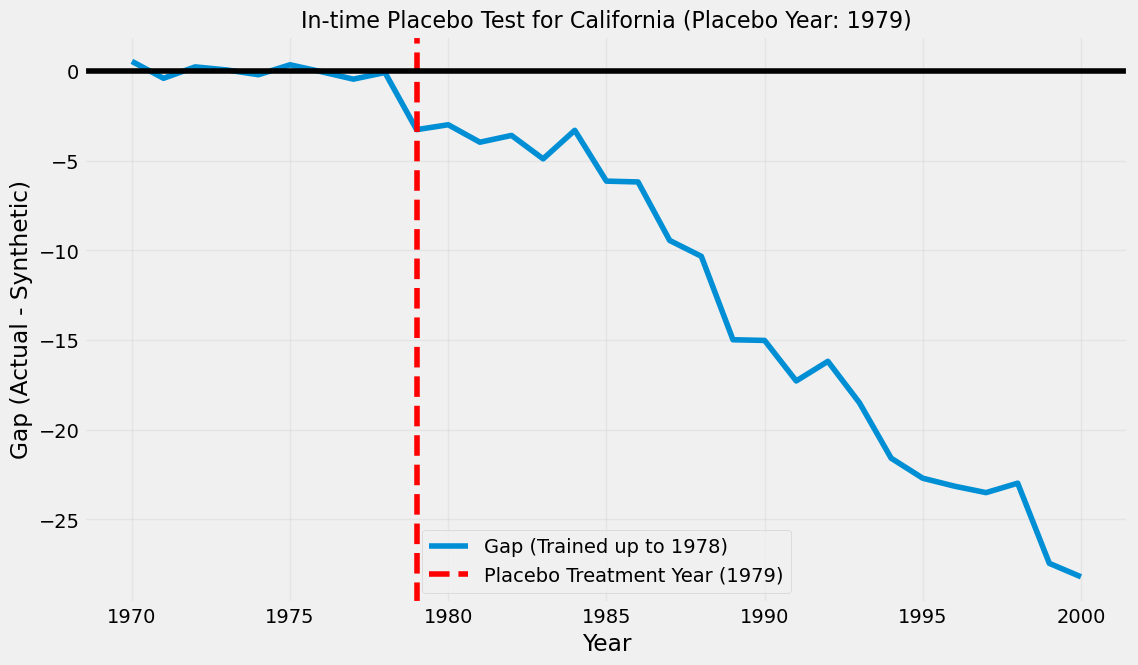
실제 정책이 없었던 1979년을 가상의 처리 시점으로 설정하고, 1978년까지의 데이터만으로 Synthetic Control 모델을 학습시켰습니다.
Gap(실제값 - 예측값)이 0을 유지하지 못하고 1980년대 초반부터 지속적으로 크게 하락합니다. 이 결과는 모델이 실제 정책(1988년 Proposition 99)이 없었더라도 1980년대에 이미 시작된 캘리포니아의 독자적인 담배 소비 감소 추세를 예측하지 못했음을 의미합니다. (공변량까지 같이 추가하면 올바른 결과가 나옵니다.)
3-1-2. In-Space Placebos#
정책의 영향을 받지 않은 donor pool의 각 단위들을 마치 처리 집단인 것처럼 하나씩 돌아가면서 가짜 효과들의 분포를 만들어줍니다. 이때 시각화를 통해 비교하는 방법과 정책 시행 전과 후의 MSPE를 비교하는 방법이 널리 쓰입니다.
Gap 시각화
시각화를 통해 Gap의 시계열을 비교합니다. 이상적인 결과는 처리 전 기간에는 모든 주의 Gap이 0에 가깝게 유지되다가, 처리 후 기간에는 오직 캘리포니아의 Gap만 눈에 띄게 크게 발생하는 것입니다.
RMSPE Ratio
이를 통해 각 국가별로 모델이 기본적으로 가지고 있는 예측 오차의 크기를 정규화하여 비교할 수 있습니다.
base_params['treatment_year'] =  1989

all_gaps = {
    unit: calculate_synthetic_gap(target_unit=unit, **base_params)
    for unit in cigar['state'].unique()
}

gaps_df = pd.DataFrame(all_gaps)
# Gap 시각화

fig, ax = plt.subplots(figsize=(12, 7))

ax.plot(gaps_df.index, gaps_df[3],
        color='black', linewidth=2, label='California')
control_states_to_plot = gaps_df.drop(columns=3)
ax.plot(control_states_to_plot.index, control_states_to_plot.values,
        color='lightgrey', linewidth=1, label='control states')

ax.axhline(y=0, color='black', linestyle='--', linewidth=1)
ax.axvline(x=1988, color='black', linestyle=':', linewidth=1.2)

ax.set_ylabel('gap in per-capita cigarette sales (in packs)', fontsize=12)
ax.set_xlabel('year', fontsize=12)
ax.set_title('Per-Capita Cigarette Sales Gaps', fontsize=16, pad=15)
ax.set_ylim(-40, 40)

handles, labels = ax.get_legend_handles_labels()
unique_labels = {'control states': handles[-1], 'California': handles[0]}
ax.legend(unique_labels.values(), unique_labels.keys(), loc='upper left')
<matplotlib.legend.Legend at 0x189cd3210>
# RMSPE 시각화

import matplotlib.patches as mpatches

mspe_df = (gaps_df.apply(lambda col: get_pre_post_mspe(col, 1988))
                  .T
                  .set_axis(['pre_treatment_mspe', 'post_treatment_mspe'], axis=1)
                  .assign(mspe_ratio=lambda x: x['post_treatment_mspe'] / x['pre_treatment_mspe'])
                  .sort_values(by='mspe_ratio', ascending=False))

colors = ['red' if state == 3 else 'gray' for state in mspe_df.index]

plt.figure(figsize=(10, 6))
plt.bar(range(len(mspe_df)), mspe_df['mspe_ratio'], color=colors)
plt.xticks(range(len(mspe_df)), mspe_df.index, rotation=45)

red_patch = mpatches.Patch(color='red', label='California (state = 3)')
gray_patch = mpatches.Patch(color='gray', label='Other States')
plt.legend(handles=[red_patch, gray_patch], loc='upper right')

plt.title('MSPE Ratio for Each State', fontsize=16)
plt.ylabel('MSPE Ratio (Post-treatment / Pre-treatment)', fontsize=12)
plt.xlabel('State', fontsize=12)
plt.grid(axis='y', linestyle='--', alpha=0.7)
plt.tight_layout()
plt.show()
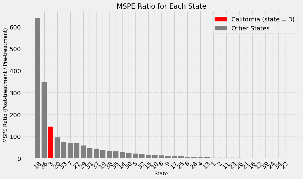
위에서 정의한 RMSPE 비율을 캘리포니아뿐만 아니라, 다른 모든 통제 집단에 대해서도 똑같이 계산하여 캘리포니아의 비율이 얼마나 극단적인 값인지를 확인합니다.
로 정의되며, Califorina의 경우 39개의 주 중에서 3번째로 RMSPE의 값이 크기 때문에 \(3/39 \approx 0.0769\) 의 p-value를 가집니다. 이는 캘리포니아에서 관찰된 것만큼 크거나 더 큰 RMSPE 비율을 얻을 확률이 약 7.7%이다라는 뜻이며, 10% 유의수준에서 통계적으로 유의하다고 볼 수 있습니다.
3-2. Leave-one-out#
Donor pool이 특정 주에 의존하는지 확인하기 위해 우리는 donor pool의 robustness를 확인할 수 있습니다. 한 개의 주를 제외하고 weight를 다시 계산하여 특정 주에만 의존하여 값이 나온 것은 아닌지 확인할 수 있습니다.
contributing_indices = np.where(calif_weights > 1e-5)[0]
donor_units = cigar['state'].unique()
donor_units = donor_units[donor_units != 3]
contributing_states = donor_units[contributing_indices]
print("Donor pool 구성:", contributing_states)

leave_one_out_paths = {}
for j in contributing_indices:
    donor = donor_units[j]

    # donor j 제외
    X_minus_j = np.delete(X, j, axis=1)
    donors_minus_j = np.delete(donor_units, j)
    w_minus_j = get_w(X_minus_j, y)

    synth_minus_j = (
        cigar.query("~california")
        .pivot(index='year', columns="state")["cigsale"]
        [donors_minus_j]
        .values
        .dot(w_minus_j)
    )

    leave_one_out_paths[donor] = synth_minus_j


years = cigar['year'].unique()
plt.figure(figsize=(10, 6))
plt.plot(years, cigar.query("state == 3")["cigsale"], label="California (Actual)", color='black')
plt.plot(years, calif_synth, label="Synthetic California (Baseline)", color='red', linewidth=2)

for donor, path in leave_one_out_paths.items():
    plt.plot(years, path, linestyle='-', alpha=0.5, label=f"Without {donor}")

plt.axvline(1988, color='gray', linestyle=':', label="Proposition 99")
plt.title("Leave-One-Out Sensitivity: Synthetic Control for California")
plt.xlabel("Year")
plt.ylabel("Cigarette Sales (per capita)")
plt.legend(bbox_to_anchor=(1.05, 1), loc='upper left')
plt.tight_layout()
plt.show()
Donor pool 구성: [ 5 21 22 23 34]
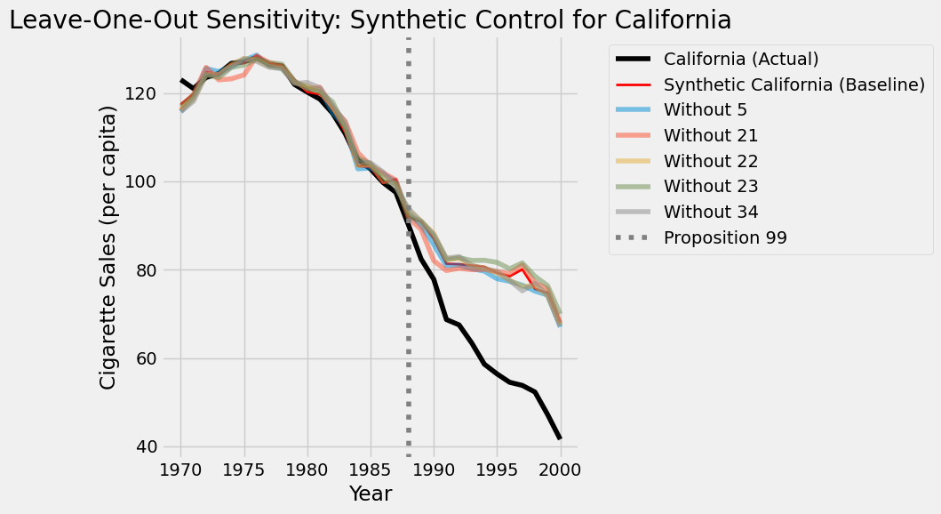
특정 주에 의존하지 않고 donor pool이 구성됐음을 확인할 수 있습니다.
4. Dealing with Uncertainty (Inference)#
일반적으로 우리는 통계적 추론을 위해 신뢰구간 (confidence interval)을 사용하지만, 지금의 상황에서는 사용하기가 어렵습니다. (cite: Abadie et al. 2015)
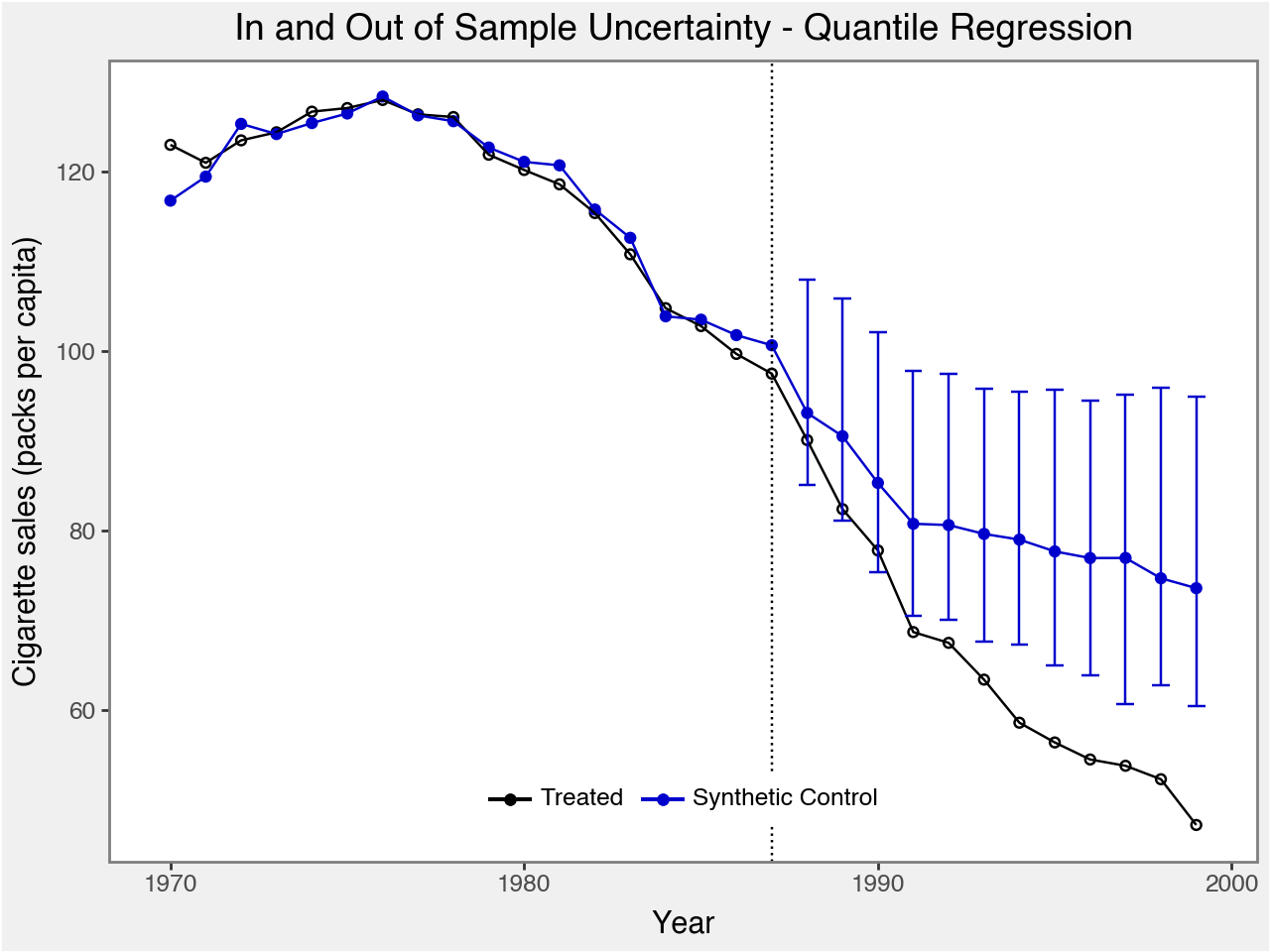
이를 보완하기 위해 우리는 예측구간(prediction interval)을 사용하여 불확실성을 추정합니다. 이 예측구간은 모델 가중치 자체의 불확실성(in-sample)과 데이터 고유의 무작위적 노이즈(out-of-sample)를 모두 반영하여 신뢰도를 높입니다. 이번 섹션에서는 해당 내용을 직접 구현하기보다는, 2025년까지 활발히 업데이트되고 있는 scpi를 통해 구현하고자 합니다.
또한, scpi는 예측구간 추정 기능과 더불어 정규화(Regularization) 옵션도 제공하여, 통제 집단이 많을 때 발생하는 과적합 문제를 완화하는 등 높은 활용성을 가집니다.
시작하기 전 가상환경 설정을 체크해주세요.
[Dependencies] (의존성 체크 필요)
conda install -c conda-forge "numpy>=1.20.1" "pandas>=1.5.0" "scikit-learn>=0.24.1" "scipy<1.11" "statsmodels>=0.12.2"
pip install "scpi-pkg" "dask>=2021.04.0" "ecos>=2.0.7" "luddite>=1.0.2" "plotnine>=0.8.0" "cvxpy>=1.1.18"
%pip install scpi_pkg -q
Note: you may need to restart the kernel to use updated packages.
from scpi_pkg.scdata import scdata
from scpi_pkg.scest import scest
from scpi_pkg.scpi import scpi
from scpi_pkg.scplot import scplot
4-1. 직접 구현한 내용과 라이브러리 비교#
라이브러리 활용 과정은 다음과 같습니다.
STEP 1: 데이터 준비
data_prep = scdata(
    df=data,
    id_var="state",            # 단위 식별자
    time_var="year",           # 시간 변수
    outcome_var="cigsale",     # 결과 변수 (담배 판매량)
    period_pre=period_pre,     # 개입 이전 기간
    period_post=period_post,   # 개입 이후 기간
    unit_tr=unit_tr,           # 처리 집단 (예: California)
    unit_co=unit_co,           # donor pool (나머지 주들)
    constant=True,
    cointegrated_data=True,
    features= features         # 공변량
    cov_adj=...
)
STEP 2: 데이터 추정
est.si = scest(data.prep, w_constr={'name':'simplex'})
print(est.si)
STEP 3: 추론 및 시각화
pi.si = scpi(
    data.prep,
    sims=sims,
    w_constr={'name': mtd},
    ...
)
plot = scplot(pi.si, x_lab='Year', y_lab='GDP per capita...')
# outcome과 feature 지정 (공변량 retprice 까지만 활용)
outcome_var = "cigsale"
features = ["cigsale", "retprice"]

# 기간 지정
period_pre = np.arange(1970, 1988)
period_post = np.arange(1988, 2000)

# 처리집단/대조군 지정
unit_tr = int(cigar.loc[cigar["california"], "state"].unique()[0])
unit_co = cigar.loc[~cigar["california"], "state"].unique().tolist()

# 데이터 준비
data_prep = scdata(
    df=cigar,
    id_var="state",
    time_var="year",
    outcome_var=outcome_var,
    period_pre=period_pre,
    period_post=period_post,
    unit_tr=unit_tr,
    unit_co=unit_co,
    features=features
)

# 합성통제 추정
est = scest(data_prep, w_constr={'name':'simplex'})
print(est)

# 추론 + 플롯
pi = scpi(data_prep, sims=1000, w_constr={'name':'simplex'})
plot_simplex = scplot(pi, x_lab="Year", y_lab="Cigarette sales (packs per capita)")
-----------------------------------------------------------------------
Call: scest
Synthetic Control Estimation - Setup

Constraint Type:                                                simplex
Constraint Size (Q):                                                  1
Treated Unit:                                                         3
Size of the donor pool:                                              38
Features                                                              2
Pre-treatment period                                          1970-1987
Pre-treatment periods used in estimation per feature:
 Feature  Observations
 cigsale            18
retprice            18
Covariates used for adjustment per feature:
 Feature  Num of Covariates
 cigsale                  0
retprice                  0

Synthetic Control Estimation - Results

Active donors: 6

Coefficients:
                    Weights
Treated Unit Donor
3            1       -0.000
             10       0.000
             11       0.000
             12       0.000
             13      -0.000
             14      -0.000
             15       0.000
             16       0.000
             17      -0.000
             18      -0.000
             19       0.007
             2       -0.000
             20       0.000
             21       0.139
             22       0.089
             23       0.432
             24       0.000
             25       0.000
             26       0.000
             27      -0.000
             28       0.000
             29      -0.000
             30      -0.000
             31       0.000
             32      -0.000
             33       0.000
             34       0.236
             35      -0.000
             36      -0.000
             37       0.000
             38       0.000
             39       0.000
             4        0.000
             5        0.097
             6        0.000
             7       -0.000
             8        0.000
             9        0.000

-----------------------------------------------
Estimating Weights...
Quantifying Uncertainty

 iterations completed (10%)
 iterations completed (20%)
 iterations completed (30%)
 iterations completed (40%)
 iterations completed (50%)
 iterations completed (60%)
 iterations completed (70%)
 iterations completed (80%)
 iterations completed (90%)
1000/1000 iterations completed (100%)
# 이전 결과와 비교

plt.figure(figsize=(10,6))
plt.plot(cigar.query("california")["year"], cigar.query("california")["cigsale"], label="California")
plt.plot(cigar.query("california")["year"], calif_synth, label="Synthetic Control")
plt.vlines(x=1988, ymin=40, ymax=140, linestyle=":", lw=2, label="Proposition 99")
plt.ylabel("Per-capita cigarette sales (in packs)")
plt.legend();
plot_simplex
4-2. Uncertainty with Regularization (Simplex, Ridge, Lasso)#
통제 집단이 많을 때는 과적합 문제가 쉽게 발생할 수 있습니다.
이를 보완하기 위해 정규화 (Regularization) 를 사용할 수 있습니다.
일반적으로 Ridge는 가능한 한 많은 통제 집단을 쏠림 없이 조금씩 모두 활용하여 부드럽고 안정적인 합성 통제 집단을 만들고 싶을때, Lasso는 소수의 핵심 집단만을 골라내고 싶을 때 쓰기 유용합니다. (변수 선택의 효과가 있습니다.)
# Feature Scaling

from sklearn.preprocessing import StandardScaler

scaler = StandardScaler()
cigar[['cigsale','retprice']] = scaler.fit_transform(cigar[['cigsale','retprice']])
methods = ['simplex', 'lasso', 'ridge']
results = {}
plots = []

# 동일한 옵션
sims = 1000
u_order = 1
u_lags = 0
e_order = 1
e_lags = 0
u_missp = True
u_sigma = 'HC1'
e_method = 'gaussian'
cores = 1

data_prep = scdata(
    df=cigar,
    id_var="state",
    time_var="year",
    outcome_var="cigsale",
    period_pre=np.arange(1970, 1988),
    period_post=np.arange(1988, 2000),
    unit_tr=unit_tr,
    unit_co=unit_co,
    features=["cigsale","retprice"]
)


for mtd in methods:
    print(f"Running method: {mtd}")
    pi_mtd = scpi(
        data_prep,
        sims=sims,
        w_constr={'name': mtd, 'Q': 1},
        u_order=u_order,
        u_lags=u_lags,
        e_order=e_order,
        e_lags=e_lags,
        e_method=e_method,
        u_missp=u_missp,
        u_sigma=u_sigma,
        cores=cores
    )
    results[mtd] = pi_mtd
    plots.append(scplot(pi_mtd, x_lab="Year", y_lab="Cigarette sales (packs per capita)"))
Running method: simplex
-----------------------------------------------
Estimating Weights...
Quantifying Uncertainty

 iterations completed (10%)
 iterations completed (20%)
 iterations completed (30%)
 iterations completed (40%)
 iterations completed (50%)
 iterations completed (60%)
 iterations completed (70%)
 iterations completed (80%)
 iterations completed (90%)
Running method: lassocompleted (100%)
-----------------------------------------------
Estimating Weights...
Quantifying Uncertainty

 iterations completed (10%)
 iterations completed (20%)
 iterations completed (30%)
 iterations completed (40%)
 iterations completed (50%)
 iterations completed (60%)
 iterations completed (70%)
 iterations completed (80%)
 iterations completed (90%)
Running method: ridgecompleted (100%)
-----------------------------------------------
Estimating Weights...
Quantifying Uncertainty

 iterations completed (10%)
 iterations completed (20%)
 iterations completed (30%)
 iterations completed (40%)
 iterations completed (50%)
 iterations completed (60%)
 iterations completed (70%)
 iterations completed (80%)
 iterations completed (90%)
1000/1000 iterations completed (100%)
from IPython.display import display

for mtd, p in zip(methods, plots):
    print(f"Method: {mtd}")
    display(p)
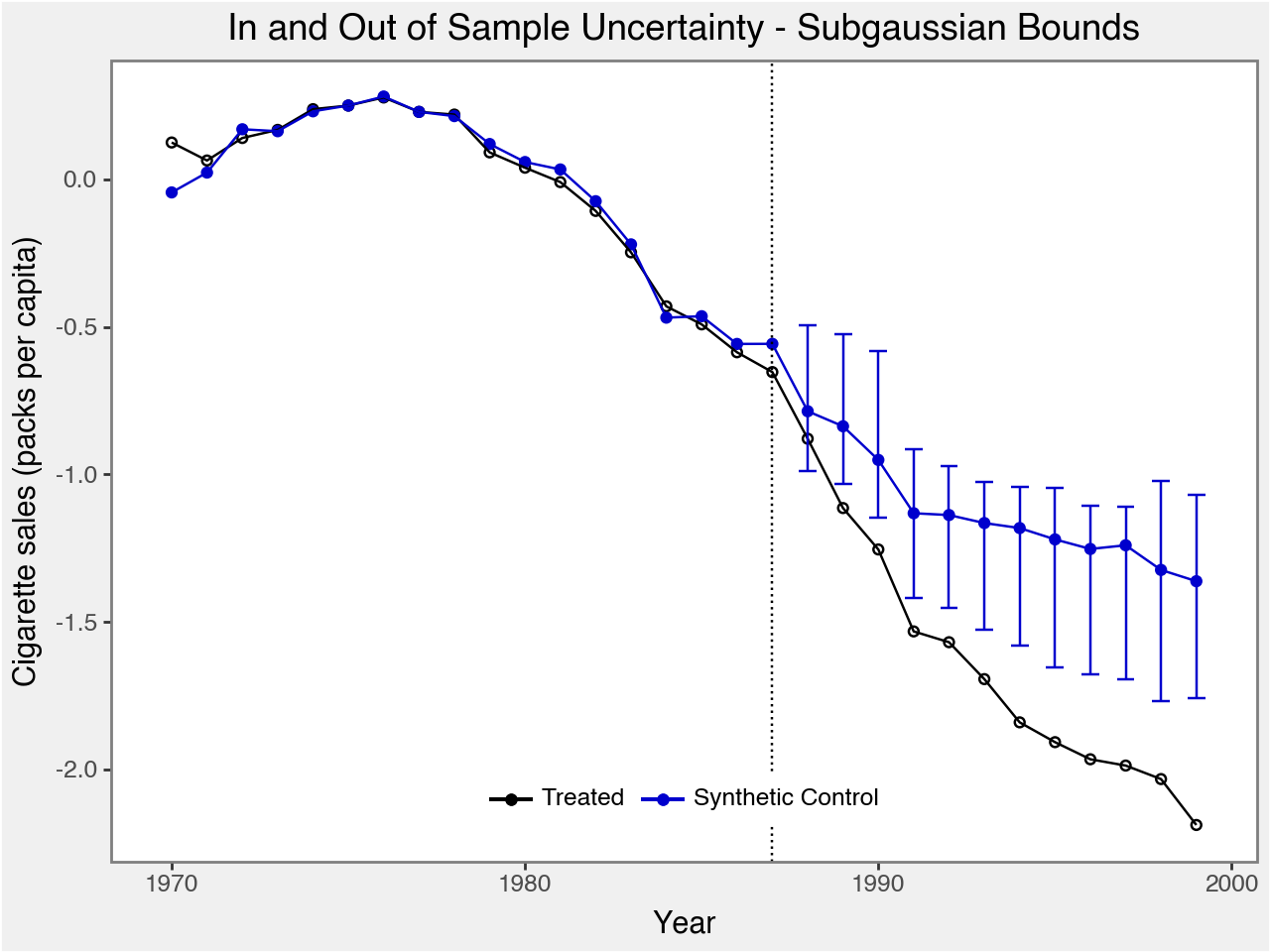
Method: simplex
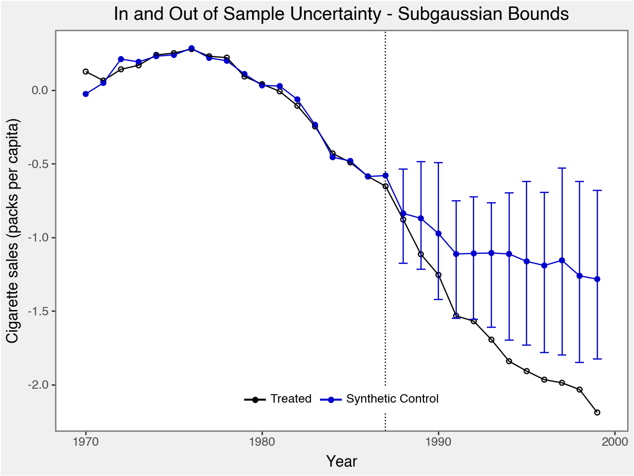
Method: lasso
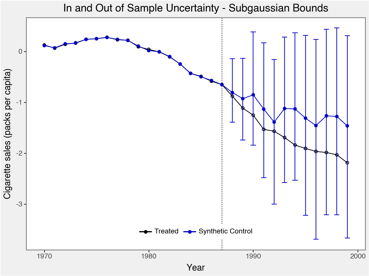
Method: ridge
** Regularization Method 고르기
현재 결과를 기준으로:
Simplex: Treated와 Synthetic이 거의 완벽히 일치, 불확실성도 비교적 작은 신뢰성 있는 추정.
Lasso: 변수 선택 효과로 인해 일부 가중치가 0이 됨. 다만 이 데이터에서 예측구간이 다소 커져서 효과 추정의 정밀도는 simplex보다 떨어짐.
Ridge: 모든 가중치를 조금씩 분산시킴. Treated와 Synthetic이 거의 완벽히 일치, 다만 이 데이터에서 예측구간이 더 커져서 효과 추정의 정밀도는 simplex보다 떨어짐.
=> 세 데이터 모두에서 캘리포니아의 담배 소비가 합성 대조군보다 더 많이 감소한다는 점은 일관되게 확인됩니다. (= Proposition 99가 흡연 감소에 기여)
[참고자료]
Abadie, A., Diamond, A., & Hainmueller, J. (2010). Synthetic Control Methods for Comparative Case Studies: Estimating the Effect of California’s Tobacco Control Program. Journal of the American Statistical Association, 105(490), 493–505.
Abadie, A., Diamond, A., & Hainmueller, J. (2015). Comparative Politics and the Synthetic Control Method. American Journal of Political Science, 59(2), 495–510.
Cattaneo, M. D., Feng, Y., Palomba, F., & Titiunik, R. (2025). scpi: Uncertainty Quantification for Synthetic Control Methods. Journal of Statistical Software, 113(1), 1–43. doi:10.18637/jss.v113.i01